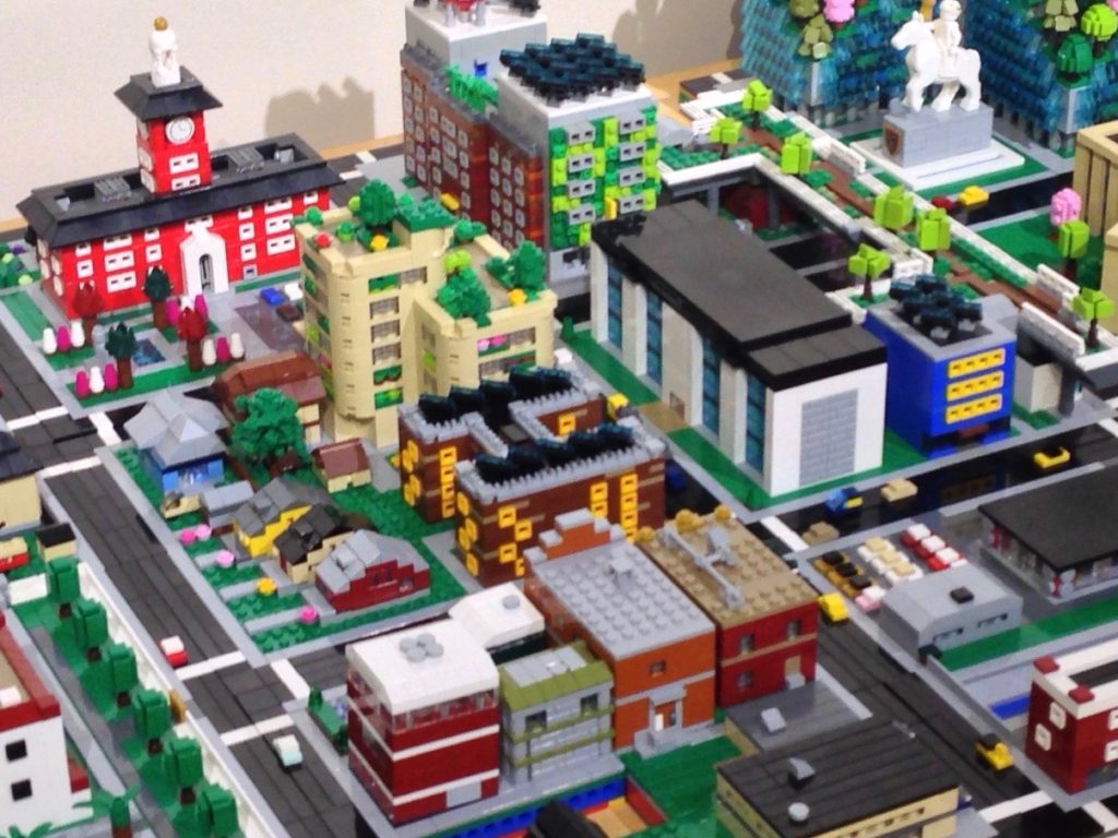
To finish out my rather incomplete survey of commercial buildings, let’s build a grocery store. Since last week’s eatery was a bit fattening, this will be a smaller organic store, the kind of business that might be equally welcome in the central city or the suburbs.
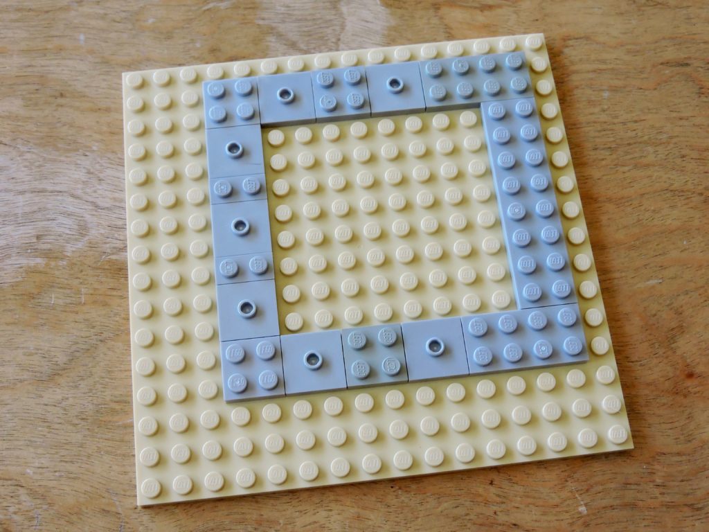
I want this building to fit on a single module with the minimum of breathing room, so I start with a 12×12 stud foundation. This give us about an 8000 square foot building, which is about a third of what you might find in a supermarket, but certainly reasonable for our needs.
I’ve used jumpers in places where I’ll be recessing windows.
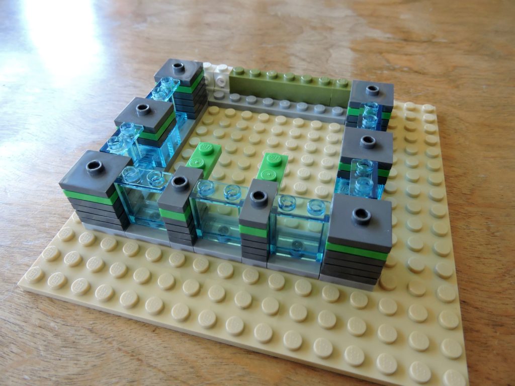
Those stacks of dark stone gray jumpers give the walls a nice texture. I’ve added the strip of bright green as a pop of color, but I had to cheat in the narrow sections, since I don’t have any 1×2 jumpers in that color (I’m not even sure if they exist).
I used olive green bricks for the back wall and a pair of white headlight bricks for service doors.
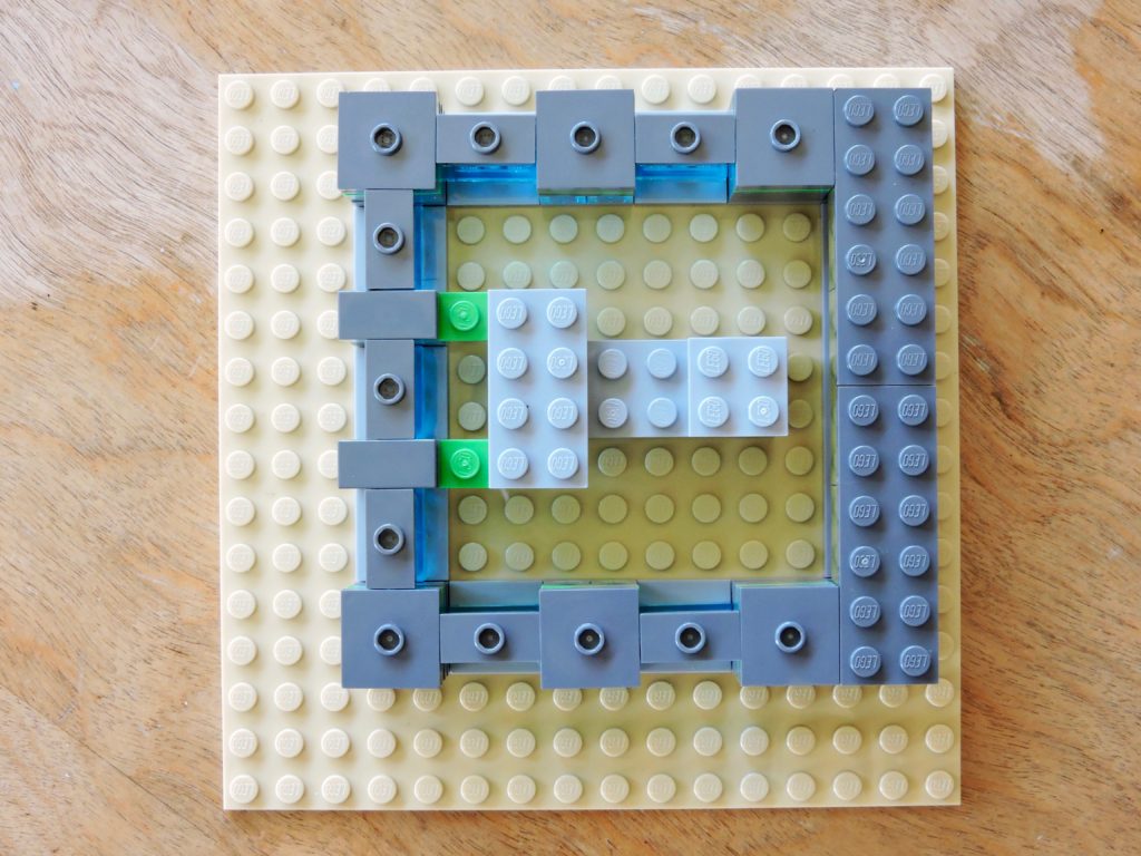
As I got ready to put the roof on my building, some of the studs needed to be realigned. I had 3 4×12 plates set aside to use as the roof. Adding 1×2 jumpers to the tops of the window panels let them line up with the tubes on the bottoms of the plates. The only real problem was the two narrower sections, so I just used tiles. I could have used 1×2 plates, but then they wouldn’t have had the same grooves as all the jumpers.
The stack of medium stone gray in the middle is there to support the roof.
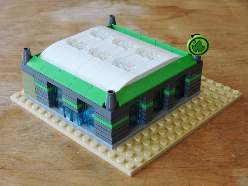
I found a bunch of 1×3 white half-bows to make that big warehouse style roof. I filled the gap down the middle with tiles, aligned in the same direction as the half-bows. Pairs of transparent cheeses act as skylights. Around the edge I used bright green double cheeses to continue the accent color from the stripe.
No grocery store is complete without a big sign, so I used a 2×2 round printed tile. I’d already used the similar 1×1 printed tile as signage for another grocery store, so this lets me define a chain of stores for my micropolis. At some point in the future, I’ll need to acquire a second one of those tiles so that my sign can be properly double-sided.
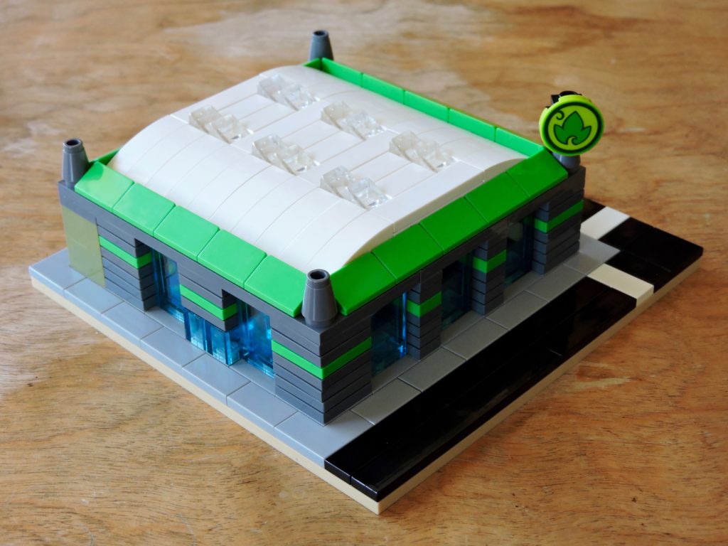
The grocery store doesn’t have any landscaping to speak off, but the sidewalks all the way around do a nice job of framing. This also makes the glass entries more obvious, built with transparent light blue bricks to match the windows. I like to mix up the transparent elements that I use for windows from building to building to simulate all of the different glazings that buildings have.
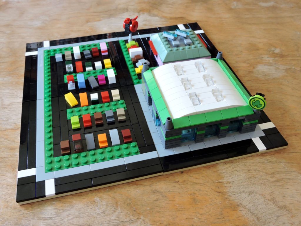
Combined with last week’s doughnut shop and a half-block of parking, I have a nice little shopping center. The emphasis is definitely on little, but it is hard to fit much more on a tiny micropolis block.
I really got a kick out of building all those cars to fill up my lot. It really pointed out that I need to start adding cars to my streets.
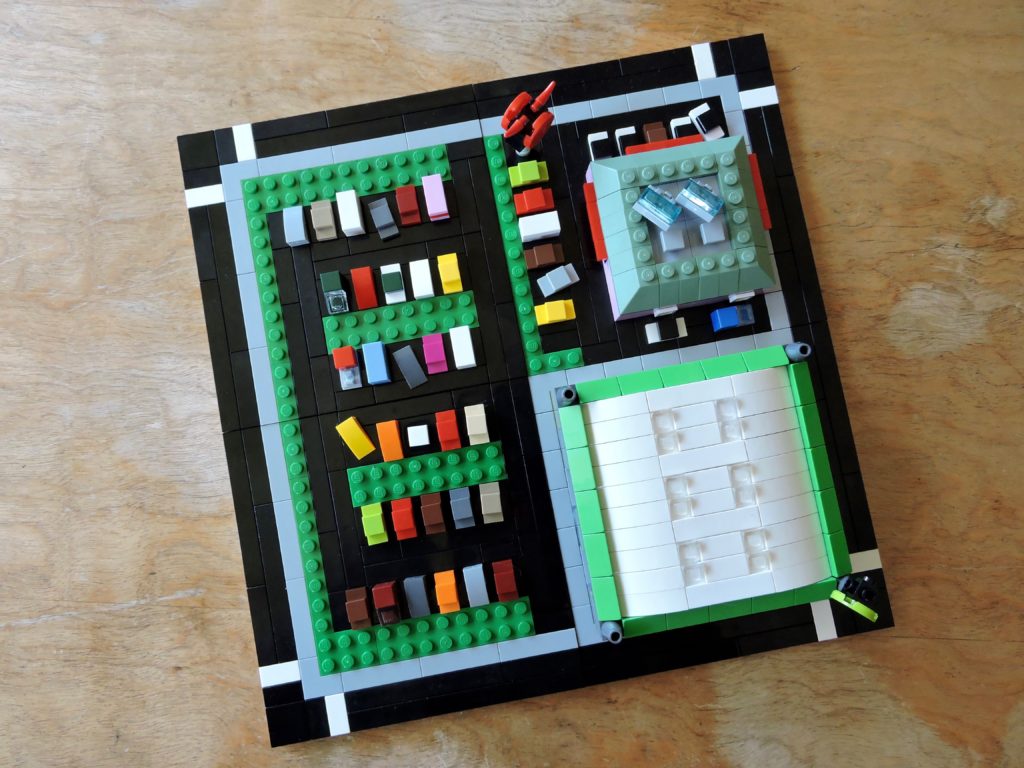
Seen from above, the percentage of space given over to parking is more obvious. It seems like a lot to me, but it really isn’t much, compared to real life shopping centers.
Next week I’ll start in on some grungy industrial lots.
Keep building and enjoy!