 Last month I participated in a fun little contest on Flickr. The competition involved building Mixel-ized versions of classic Dungeons & Dragons monsters. I’m a fan of both, so it really didn’t take much to get me started.
Each contestant was limited to three builds, but my first model leaped to mind unbidden.

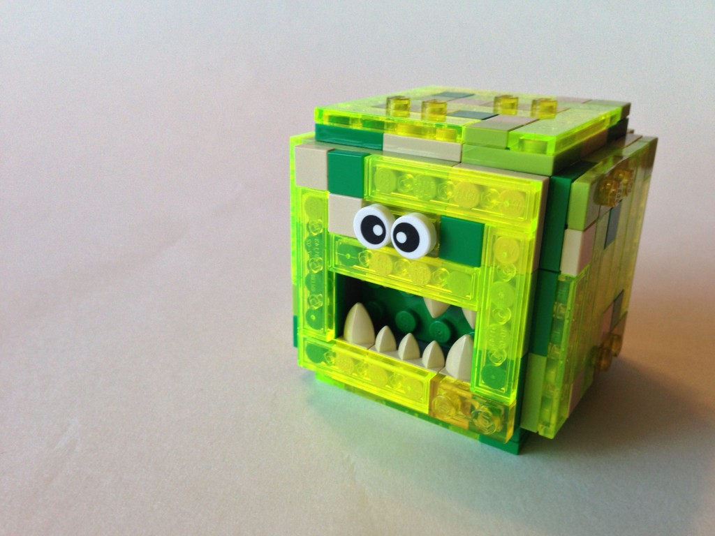
I started with a gelatinous cube. I had acquired a quantity of 1×4 translucent flourescent green tiles in a draft last summer and this seemed like the time to use them. The model’s core is a cube of snot with studs out on all six sides. Each side is then covered with a panel built from a layer of plates covered by tiles. The end effect is mottled colors that sometimes show through to layers underneath. I like him quite a bit.

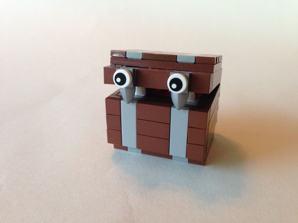
My next build felt like a close cousin of the cube, a mimic. Again, I used snot techniques to face studs out on all sides. The outermost layer is tiled to resemble timbers banded in metal. The chest hinges open (with almost too much clutch). I think this little guy really captures my love of minimalist builds.
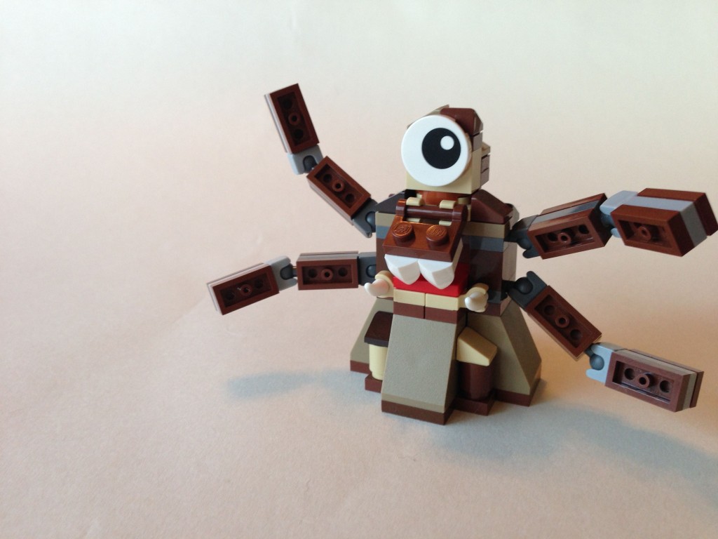
It didn’t take me that long to build my final entry, but it did take quite a while to decide on what it should be. In the end I decided upon the often forgotten roper, a monster that often disguised itself as a stalagmite or similar rock formation. Honestly, this feels like the weakest build of the three, but I was happy with him none the less, especially the sinuous tentacles.
I didn’t win any prizes for my entries, but I was quite pleased with them and they provided a change of pace from the micro builds I’ve been working on lately.
