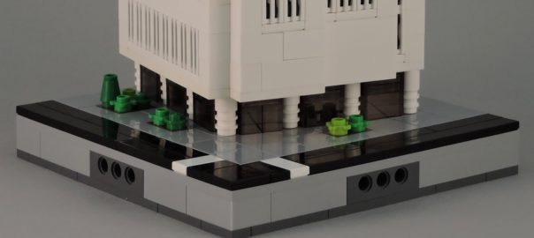
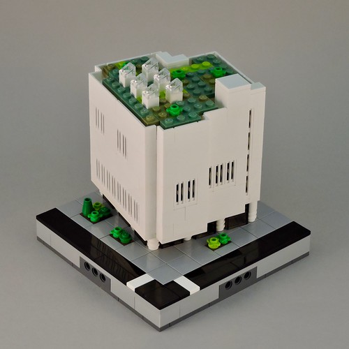
This is one of those models that started with a picture. That picture doesn’t have anything to do with the finished model, but it planted a seed in my mind. Once the idea was there, I just had to grab some bricks and start building.
Micropolis is my go-to whenever I get the itch to build a building. I figured that this would be a fairly stark building with windows that appeared mostly as a change in texture. Since the building would be minimalist, placement would be crucial.
A slight angle to the building would serve nicely. LEGO® geometry doesn’t always play well with angles, but there is a technique that works perfectly in Micropolis: the hypotenuse technique.
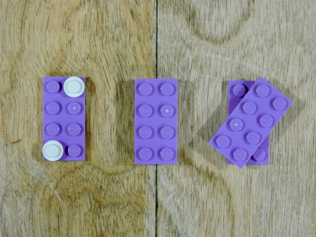
Geometry is your friend. When you draw a line through a rectangle from one corner to the opposite, it is divided into two triangles. That line you drew is the hypotenuse of both triangles. Now the cool thing is that either way you slice it, the opposite corners of a rectangle are equal distances apart. We can take advantage of this relationship (as I’ve shown above) to mount layers at a skew.
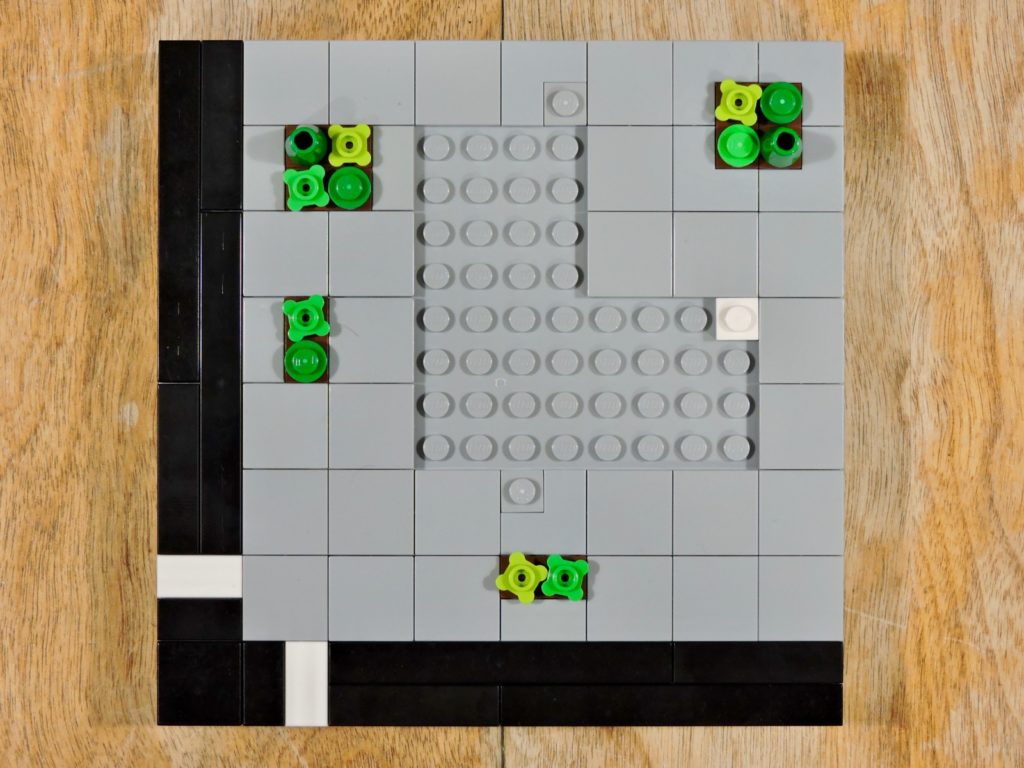
By varying the dimensions of the skewed rectangle, the angle of the skew changes. A long, narrow rectangle produces a smaller skew. Here I wanted a little skew as possible, so I made it 2×10. Since it was an even number, there was also another magic rectangle 90 degrees off (hence the one white stud). This would give me three points of connection for the building.
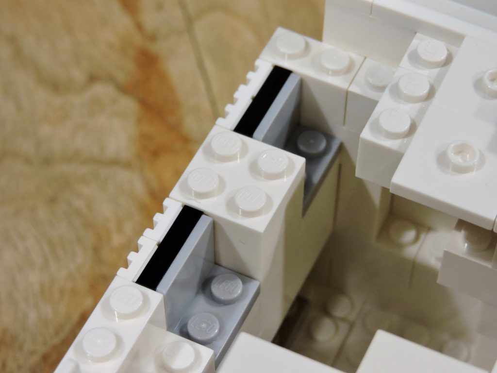
Since I wanted the windows to be a change of texture, rather than a change of material, I decided to use grills. A black plate backing and a snot bracket allowed me to mount them flush with the outside surface.
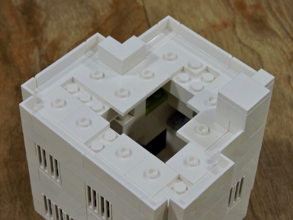
The last detail would be the roof. I lined the edge with panels to give a nice clean edge. Due to the irregular shape of the building, there were a few spots that I couldn’t panel cleanly. Those I build up with brick and topped with tile. To fill the void, I used jumpers to establish a half-stud offset. Now all I needed was a bit of clever plating.
The finished building is almost exactly as I hoped. Stark, white walls with a hint of permeability. I designed the footprint of the building to fill the available space the various steps and notches add nicely to the visual complexity of what might otherwise have been a white cube.
In addition to a green roof, I added cluster of sky lights (I can imagine them drawing natural light down into the galleries. The greenery also provides the only color on what is otherwise a monochrome model, though I think that only heightens the architectural character of the building.
It only took a couple of hours to build, but this is one of my favorite Micropolis models.
Click through the picture above to see more on flickr.
Keep building and enjoy!
