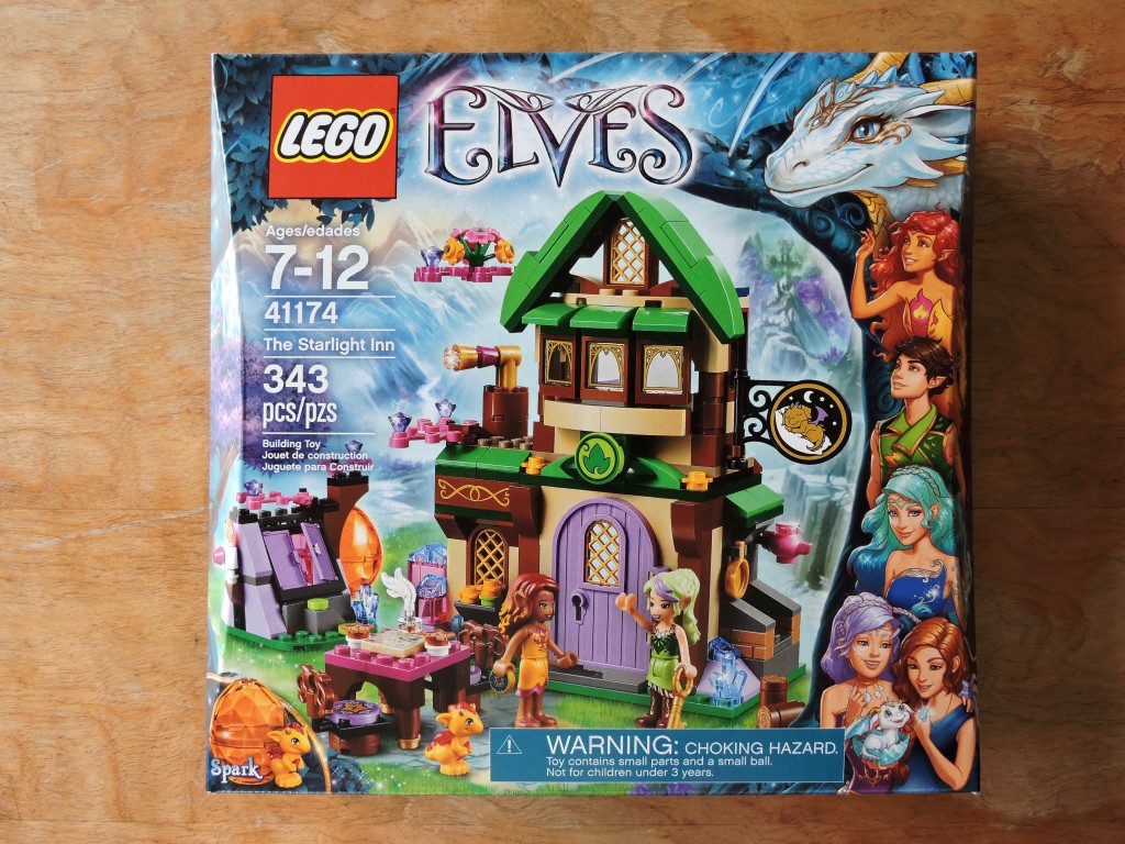
LEGO’s Elves theme is one of my favorites. Going into its second year, they have introduced a whole range of new dragon-themed sets. My LUG recently decided to draft this set at our next meeting, so I picked up an extra copy of The Starlight Inn so that I could build it for myself.
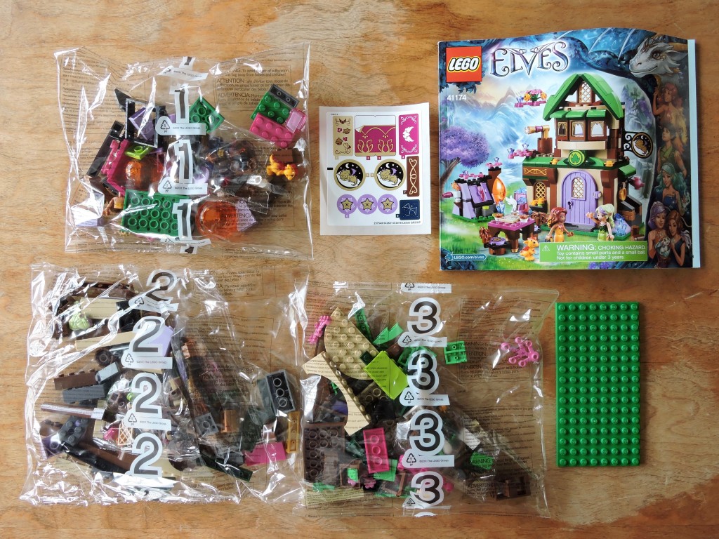
The stuff inside the box looks about right for a set in this price range: three bags of elements, an 8×16 plate, a single sheet of stickers, and a perfect-bound instruction booklet. There is a nice range of colors to be seen. Look at all the bright green!
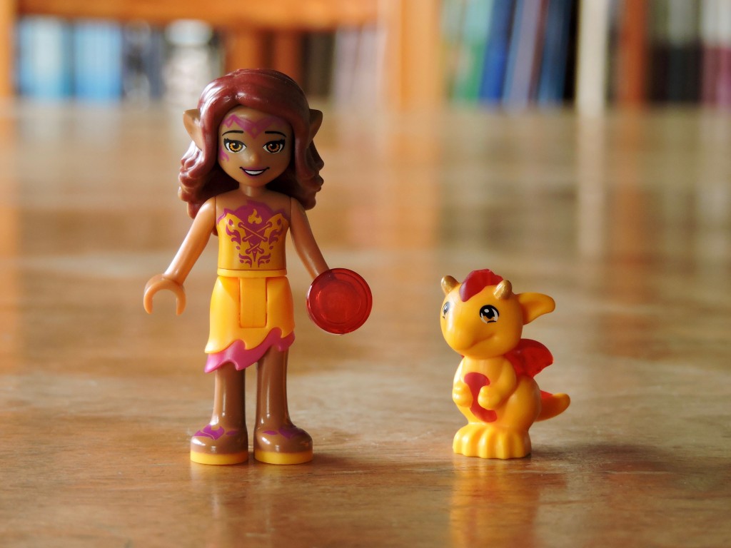
in the first bag, we meet Azari the fire elf and a baby dragon named Sparks. This is a new version of Azari. I can’t say that I’m a connoisseur of mini-dolls, but the production and printing look nice. Sparks is pretty cool too. I like that he’s over-molded with a mix of translucent red and bright light orange.
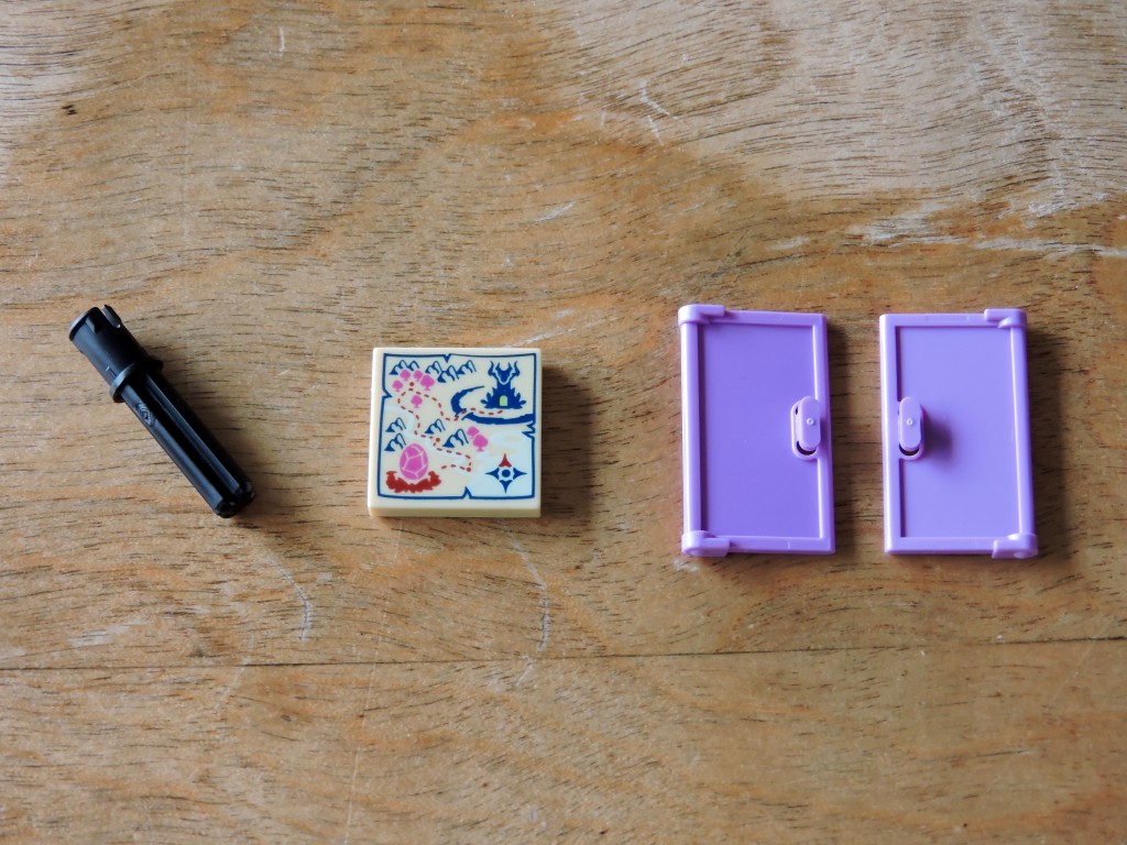
A couple of elements caught my eye right away in the first bag. This is the first time I’ve gotten my hand on this new technic pin/2l axle combination. I don’t know what I’ll use it for yet, but happy to get my hands on it. This is a new map tile for this year’s Elves sets. These doors aren’t new, but I’ve only seen them in dark stone gray before.
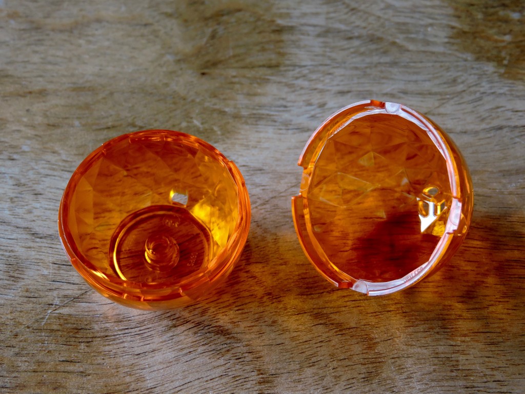
The other new element here is this two-piece egg. I haven’t had a chance to fuss with it much, but I like the faceted interior that gives it a gem-like quality. There is a stud on the interior so that the little dragon can stand inside.
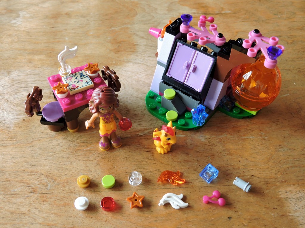
The first bag builds out the smaller bits. I don’t quite get the thing with the doors. It seems to be some kind of hutch for the dragon. The little table and chairs is nice. I particularly like the chairs and I’ll probably steal the design for one of my own models.
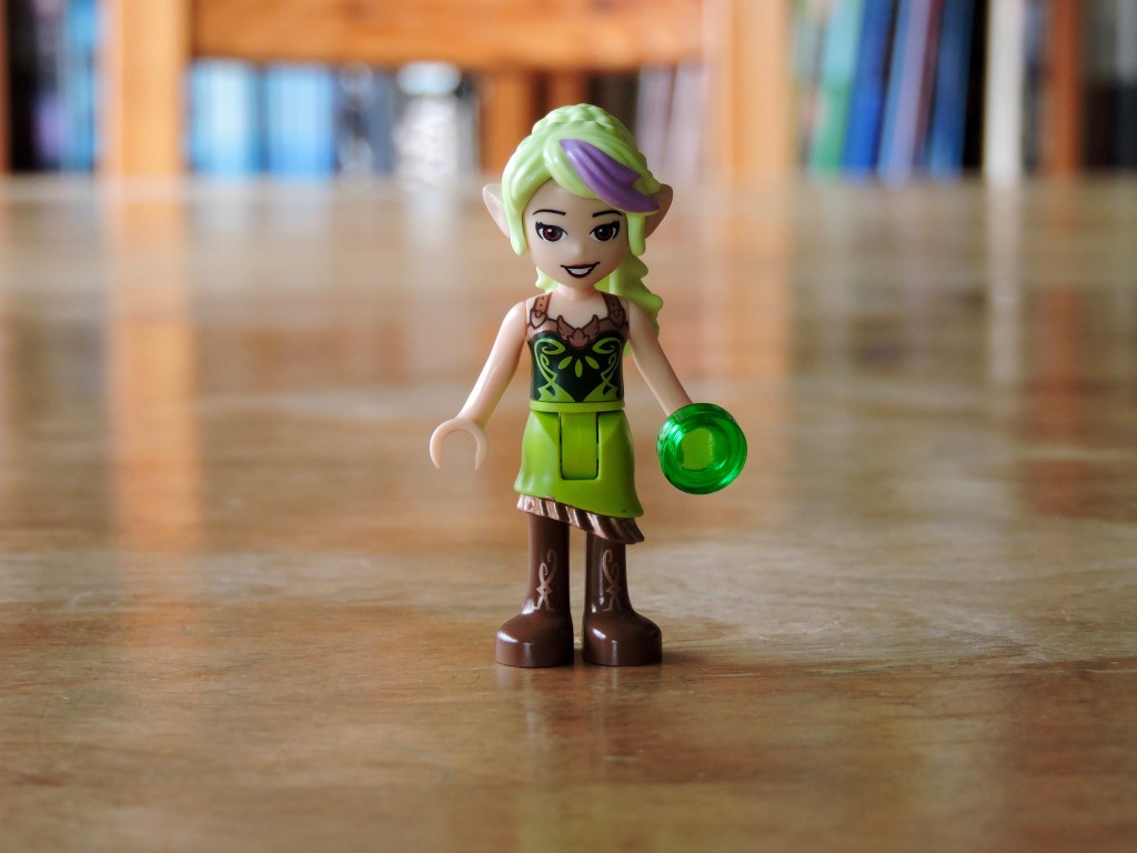
Another attractive mini-doll in the second bag.
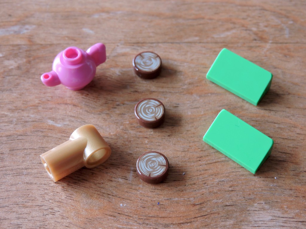
Bag 2 has some interesting new elements too. That tea-pot is new, a bit bigger than the ones I’ve seen before, but with the same attachment points. There aren’t a lot of technic elements in pearl gold, so that should be useful steampunk builders. I like this new printed tile too, but two out of the three in my set had blurry printing. I’m digging these double cheeses in bright green.
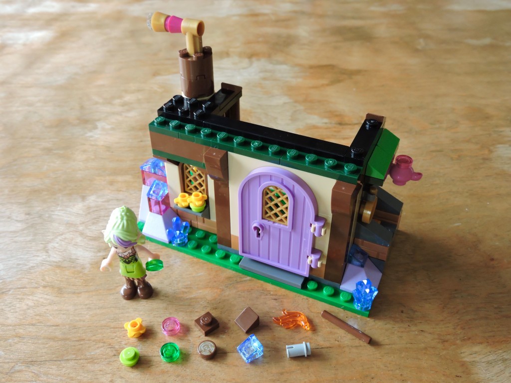
The second bag builds the ground floor of the inn. Lots of nice details here, with the crystal outcroppings and the various shades of green accent.
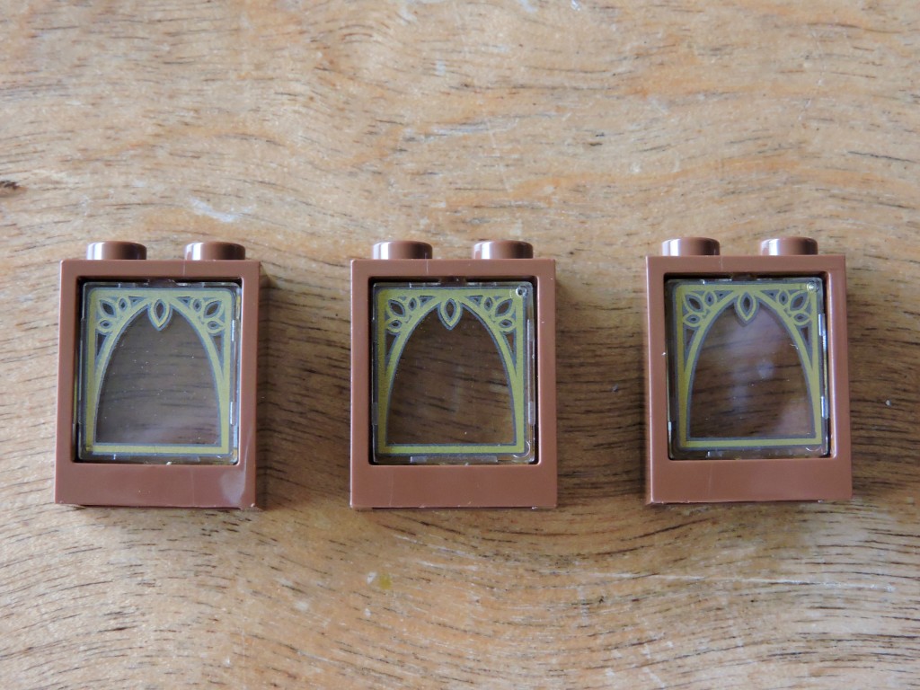
Bag 3 coughs up these lovely printed window panes. I can already see these getting used a lot in the future. That leafy motif would be great for steampunk builds and more artsy modulars.
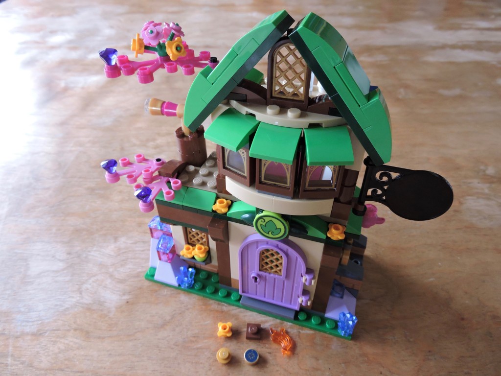
Bag three finishes out the inn, adding this second story with a bay window and the foliage. I really like the general look of this building. The bright green and dark green accents work nicely with the earthy brown tones that make up the structure. The leafy bits feel tacked on though, I would have prefered a separate tree.
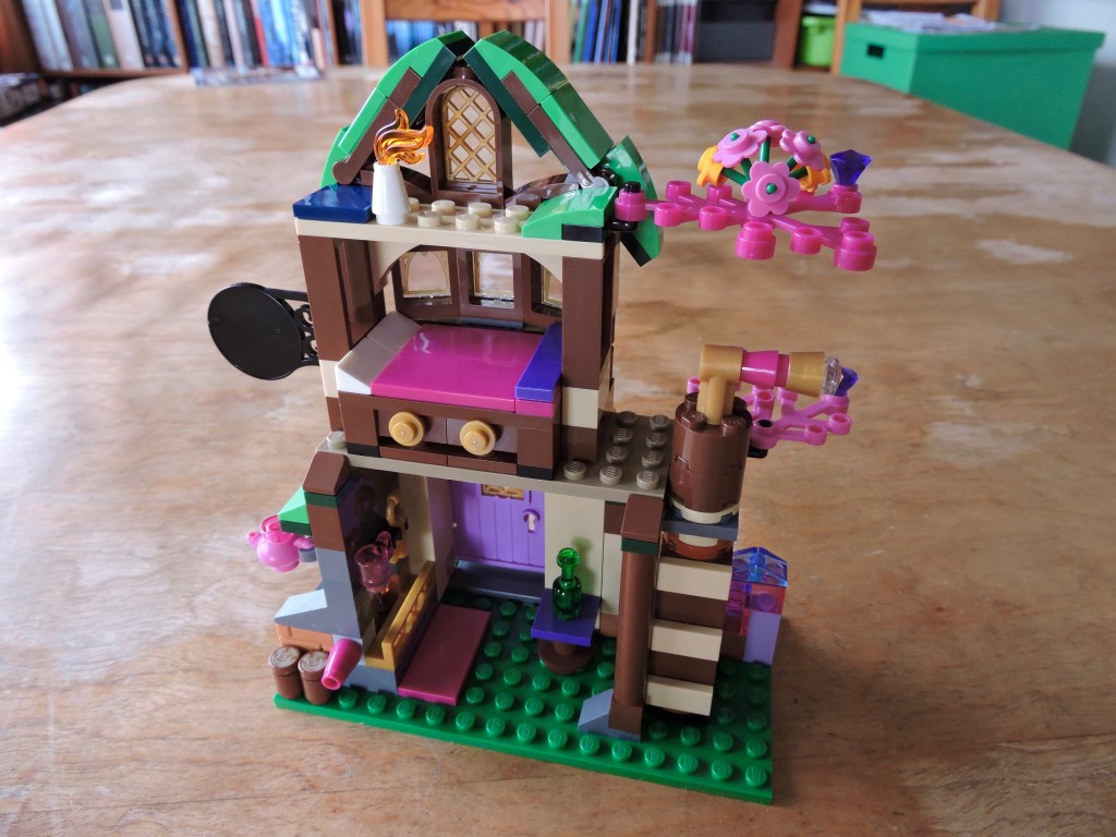
From the other side, we can see the tiny inn’s interior. There are a number of nice play features here. Twisting a knob on the side of the fireplace adjusts the flame, making it bigger or smaller. There is a drawer under the bed that pulls out, containing a case with secret contents. As usual, with the kid-focused sets, the emphasis is play over realism.
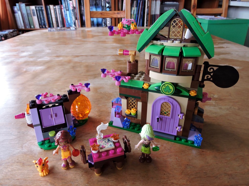
Altogether a handsome set. The finished model feels a bit small, especially compared to last year’s bakery, but I really like the aesthetic. There are some great details and a plethora of interesting elements. I’m already looking forward to drafting this one!
Keep building and enjoy!